Results
After conducting all five MCE analyses to build the predictive models described in the methods section, I visualized each model’s output on a standardized global spatial scale. Each model incorporated the same three anthropogenic impact variables (human population, agricultural land conversion, and invasive species counts), but with varying weights and/or membership models used to transform each factor.
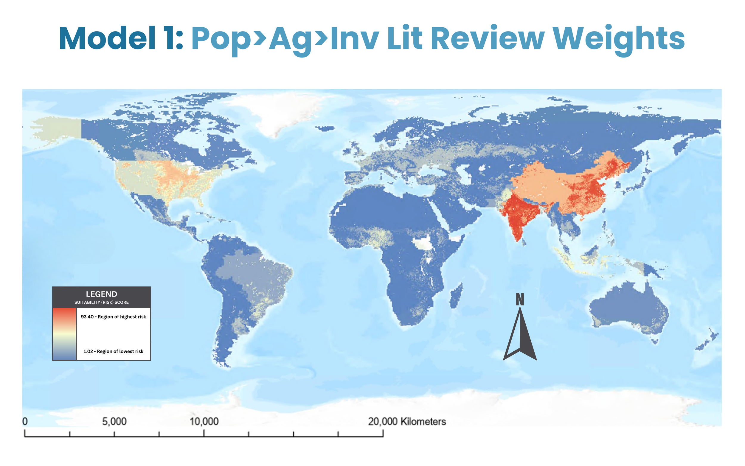
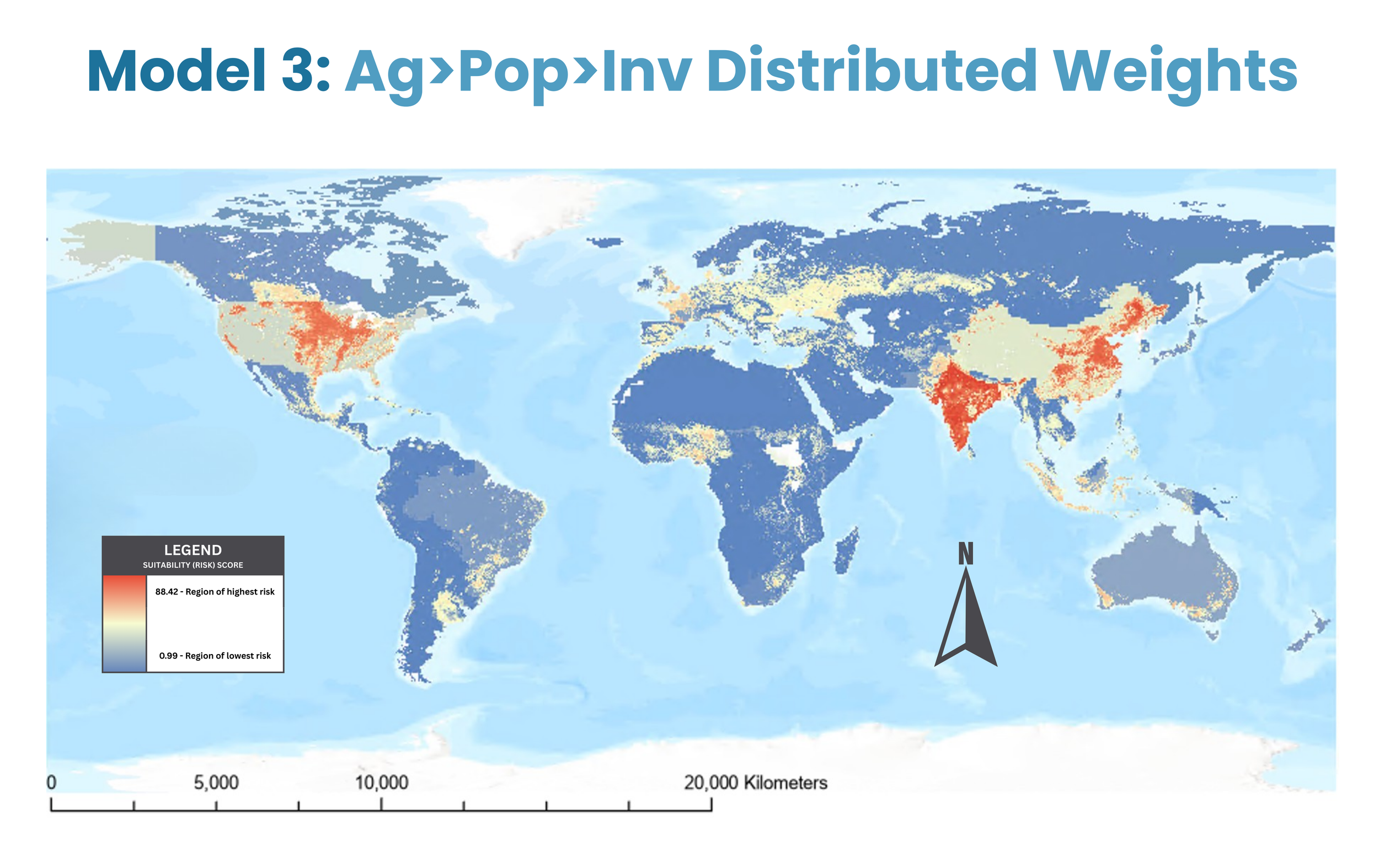
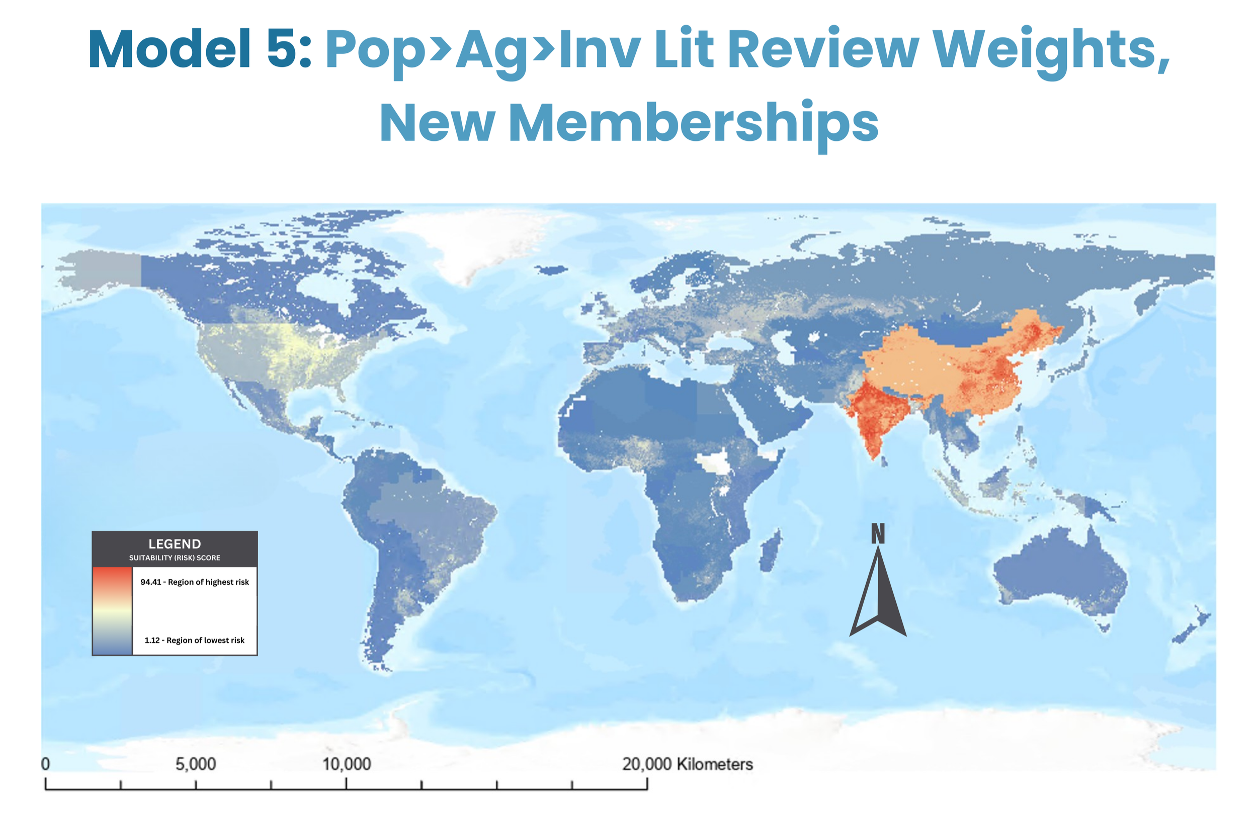
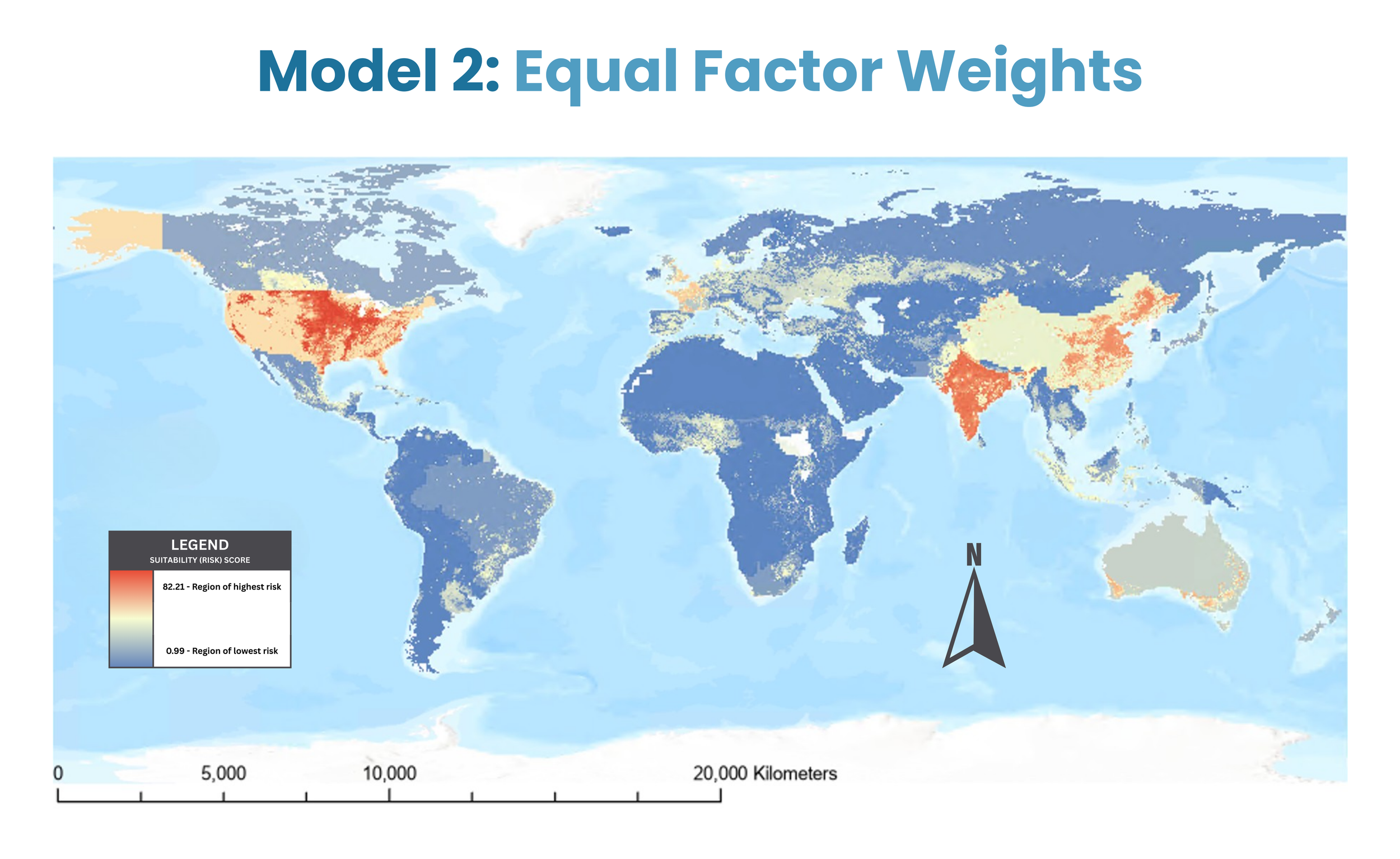
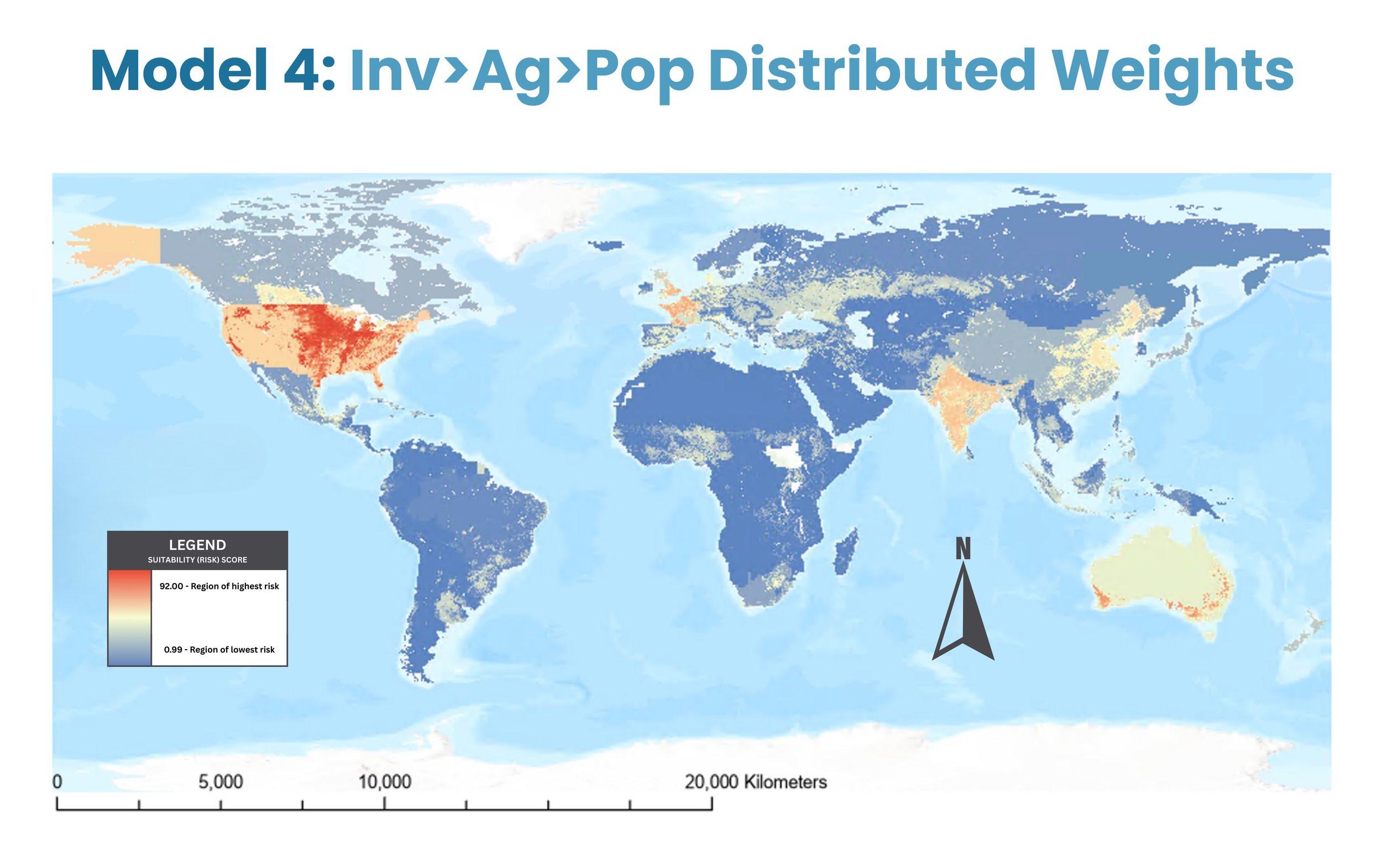
In the following maps (Figure 7), extinction risk is modeled using a color-graded scale, with blue regions indicating lower risk, yellow denoting intermediate risk, and red highlighting areas of high risk. As can be seen in the figures below, the models’ heat maps are all relatively similar, with high risk regions found in parts of Asia and North America, but some differences between models can be noted.
In Model 1 (population weight = 64.84, agricultural conversion weight = 28.42, invasive species weight = 6.75; all MSLarge membership models), the highest risk areas occur in South and East Asia, with particular emphases on India and Eastern China (risk factor ~ 93.04).
In Model 2 (population weight = 33.33, agricultural conversion weight = 33.33, invasive species weight = 33.33; all MSLarge membership models), the highest risk areas occur in central United States and India (risk factor ~ 82.21).
In Model 3 (population weight = 35.00, agricultural conversion weight = 50.00, invasive species weight = 15.00; all MSLarge membership models), the highest risk areas occur in India, Eastern China, and central United States (risk factor ~ 88.42).
In Model 4 (population weight = 15.00, agricultural conversion weight = 35.00, invasive species weight = 50.00; all MSLarge membership models), the highest risk areas occur in central United States (risk factor ~ 92.00).
In Model 5 (population weight = 64.84, agricultural conversion weight = 28.42, invasive species weight = 6.75; all Linear membership models), the highest risk areas occur in India and China (risk factor ~ 94.41).
While all models seem to highlight particular sub-continents as having moderate-high extinction risk, the variations described above suggest that model accuracy may change based on factor weighting and membership decisions. The initial model is thus moderately changeable according to this sensitivity analysis.
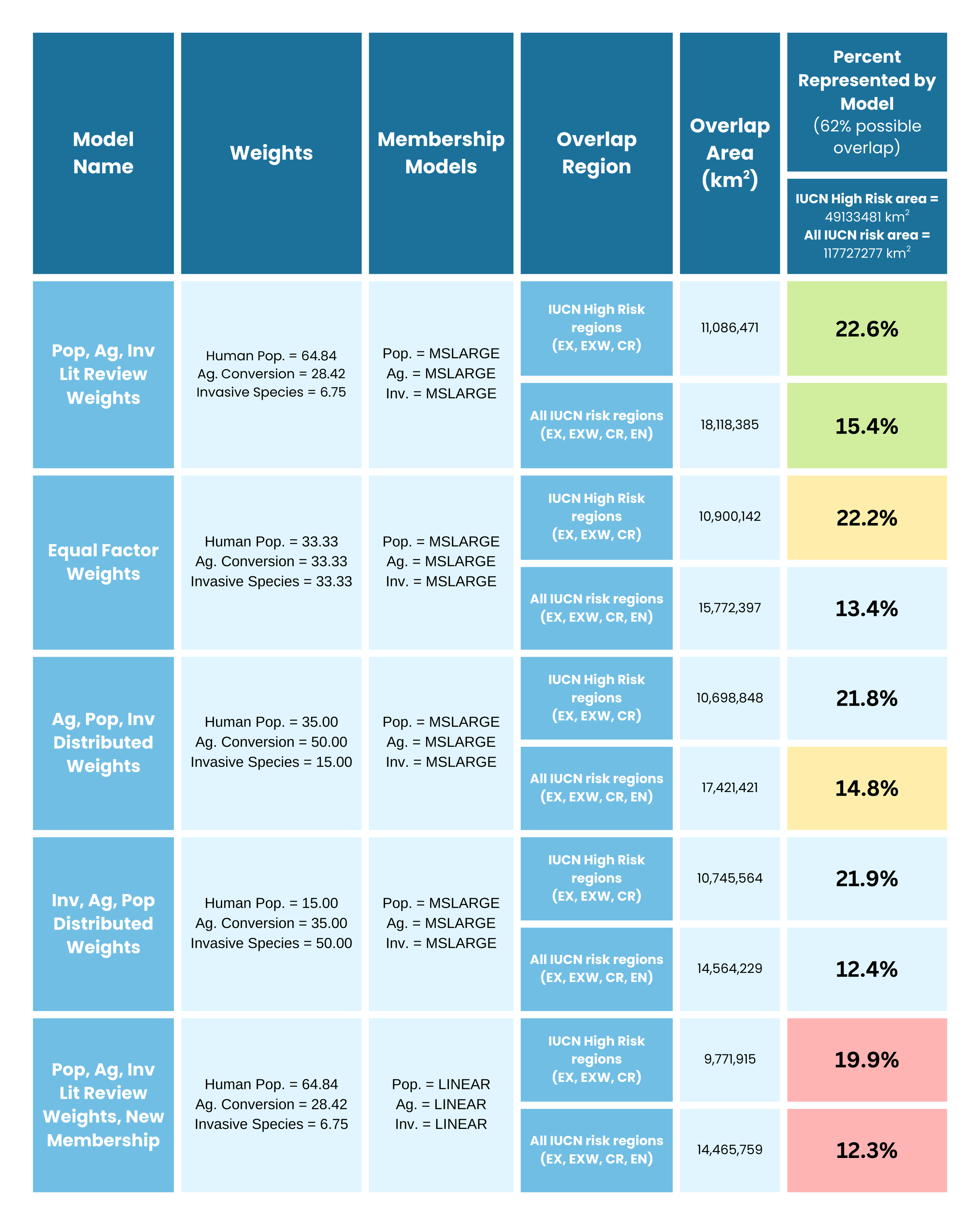
All results described in the sections above can also be found in the table to the right (Table 3), including each model’s input and transformation specifications, the geodesic area in km^2 of each region, and the percent overlap between each model’s highest risk regions and the validation data.
Results highlighted in green indicate that these are the highest overlap percentages, suggesting that this model (Model 1) was the best predictor of actual terrestrial mammalian extinction risk.
Yellow highlighted results indicate the next-best overlap scores (Models 2 and 3 for high risk regions and broader risk regions, respectively).
Red highlights indicate the worst-performing, or least accurate, model (Model 5) from this analysis.
Figure 7. Maps depicting each MCE model output with varied factor weights and membership models (exact model specifications outlined in Table 3). The colored scale on each map ranges from highest predicted risk (red) to lowest predicted risk (blue), with top risk factors ranging from 82.21 - 94.41.
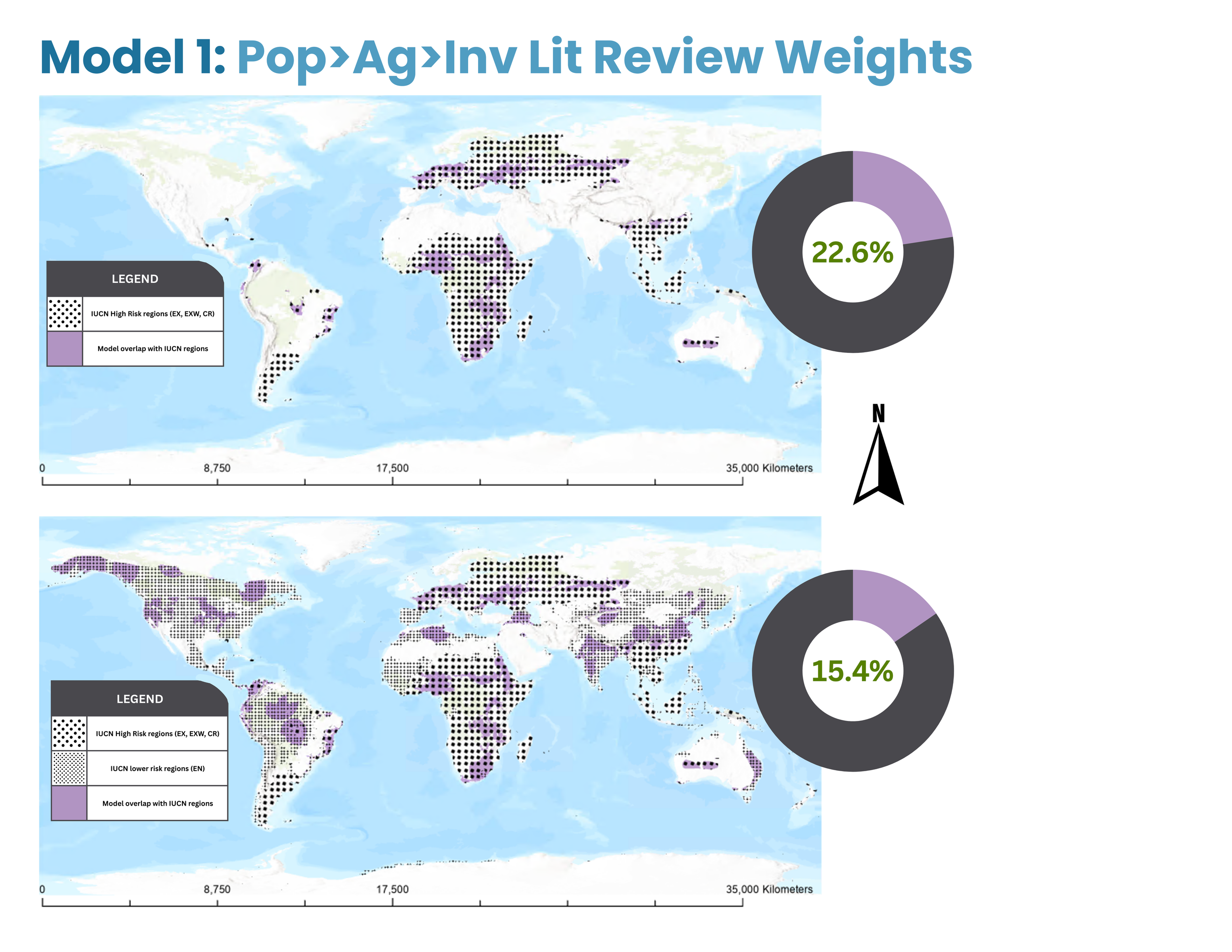
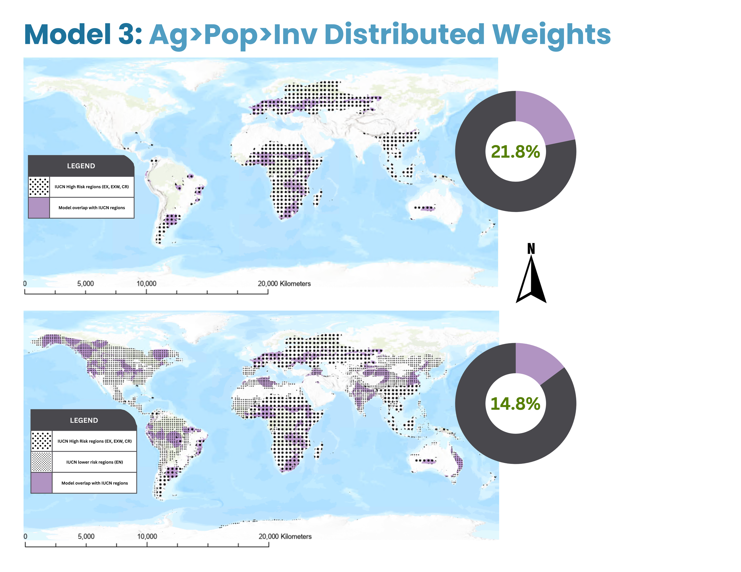
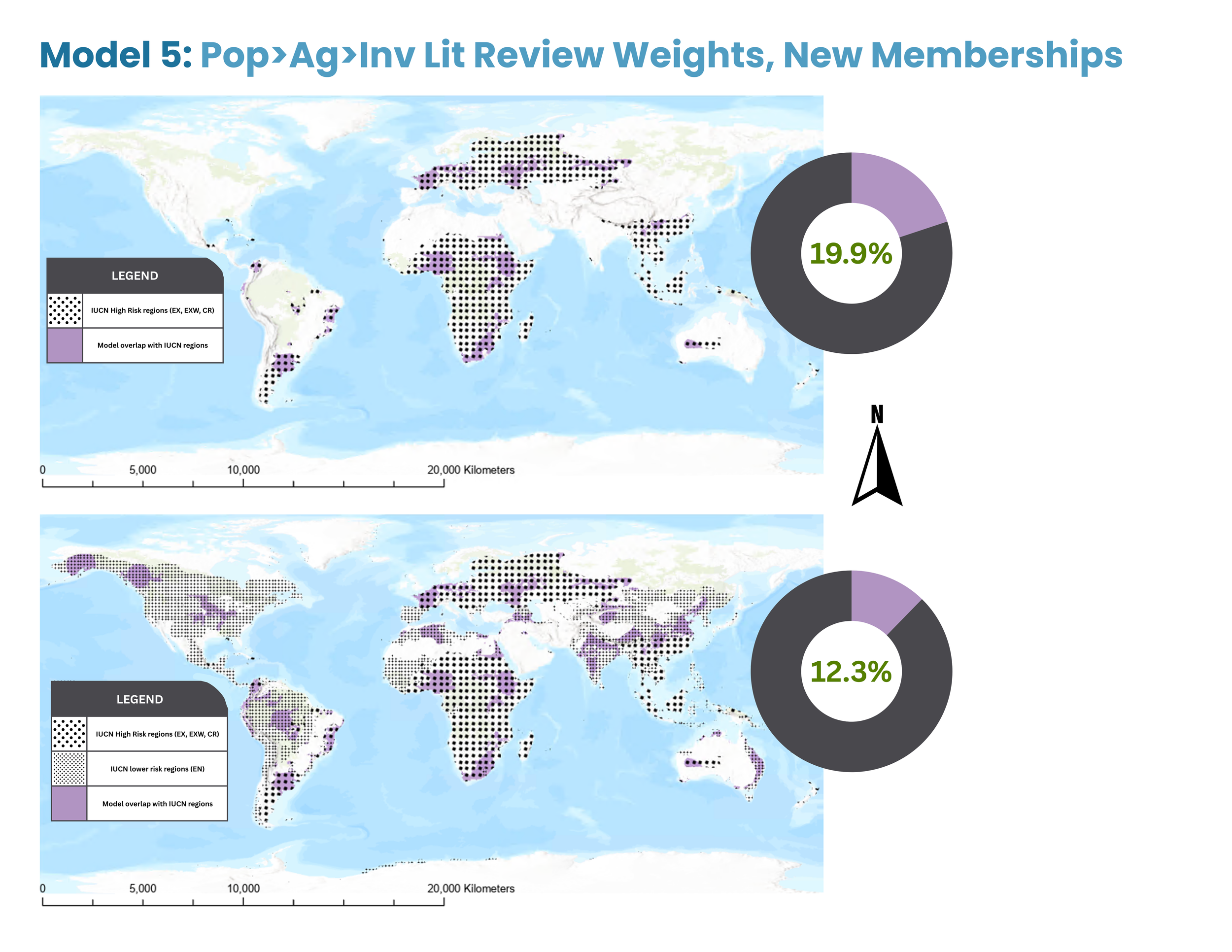
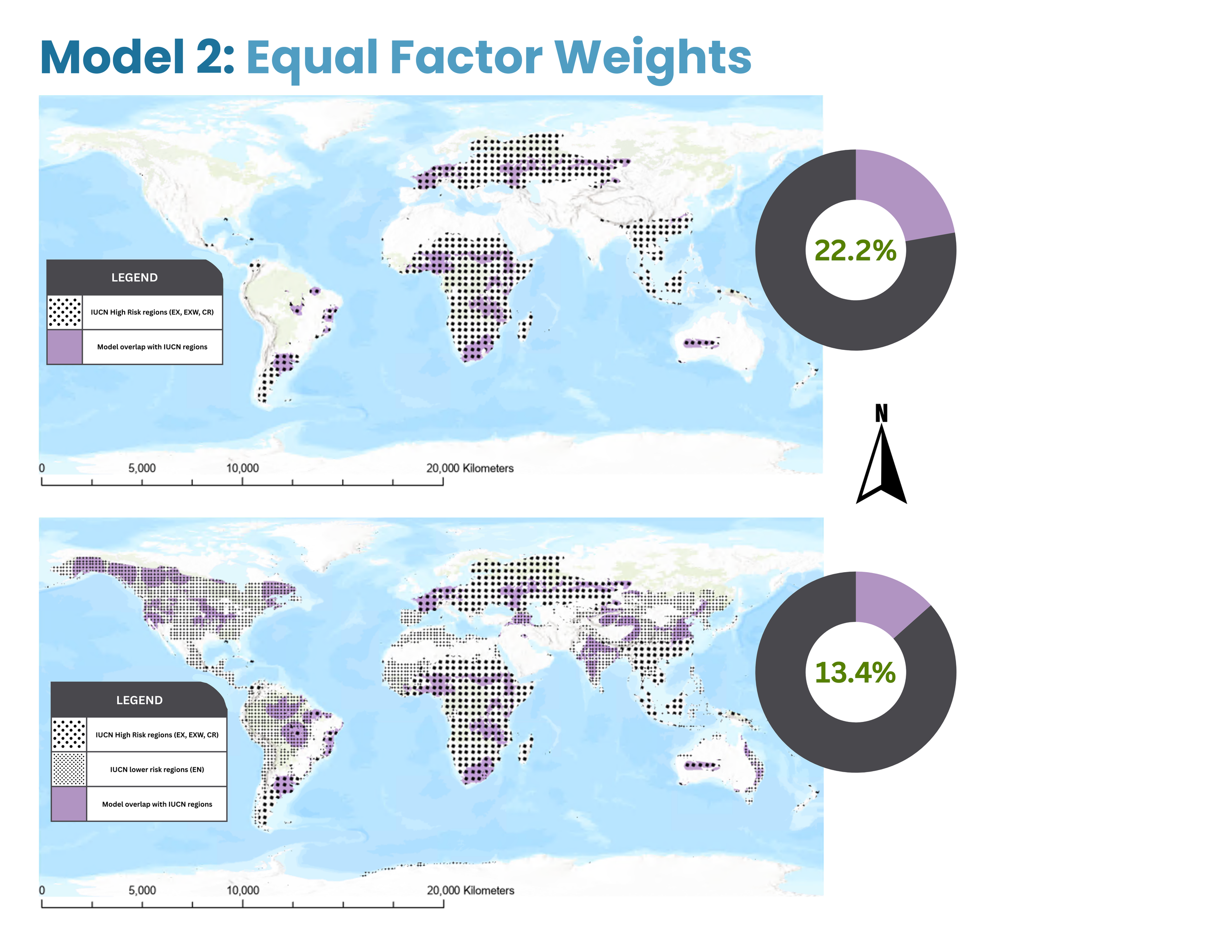
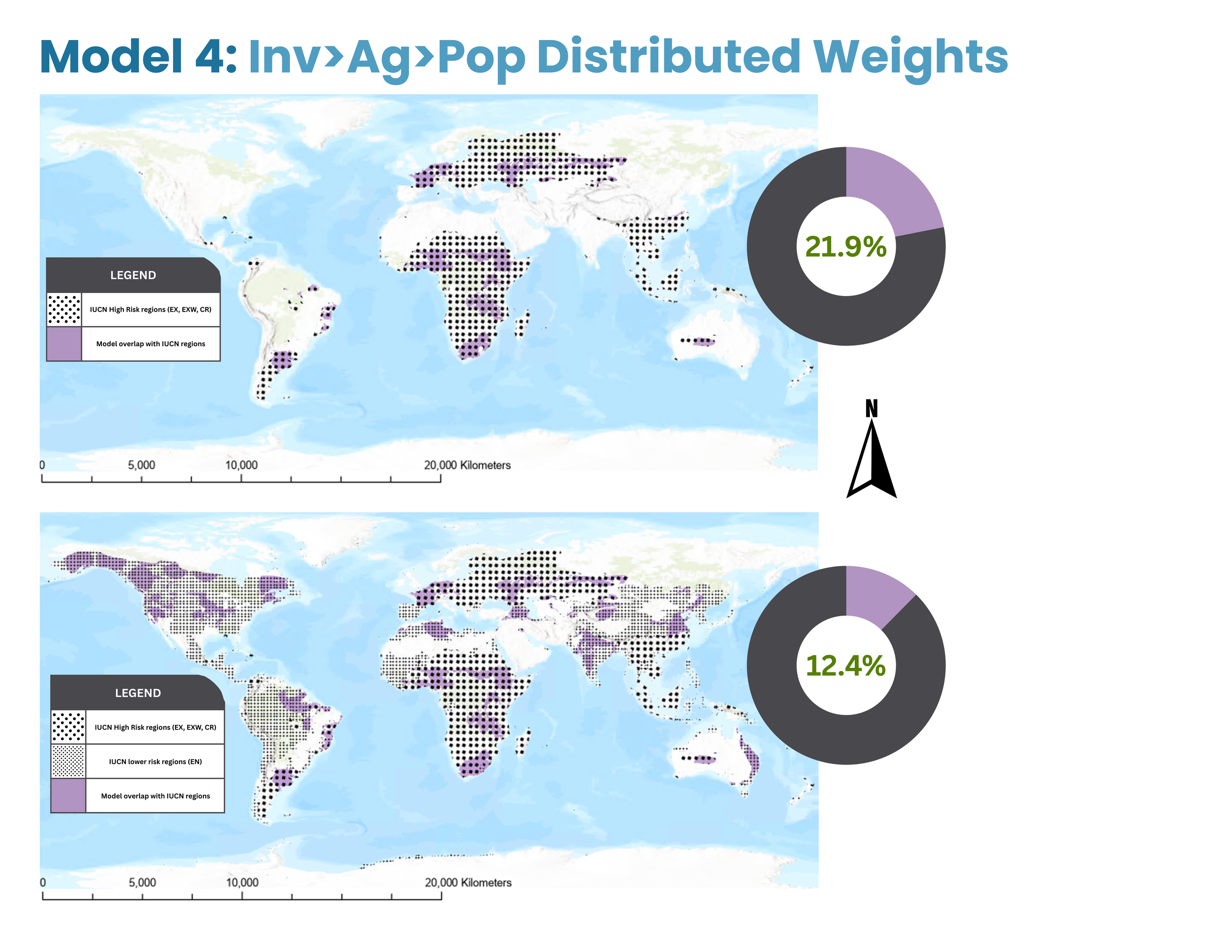
The next phase of results were based on the final phase of analysis methods. In this stage, I calculated the proportion of overlap between each model’s highest risk areas and the threatened mammal ranges from the IUCN datasets. I split each model’s analysis into two separate maps (Figure 8). The first visualizes the overlap between risk regions and mammal ranges classified as extinct (EX), extinct in the wild (EXW), or critically endangered (CR). The second depicts broader risk categories, comparing the models’ predicted high risk regions to mammal ranges classified as above in addition to species ranges considered to fall under the endangered (EN) IUCN risk category. These two iterations allowed each model to be evaluated under both more restrictive and more general risk scenarios.
In Model 1, the highest predicted risk regions (constrained to the ranges defined by the IUCN data) covered 22.6% of the total high risk (EX, EXW, CR) validation area, out of 62% total possible overlap given the total area of the model’s output compared to the total area of the high risk IUCN ranges. However, the model’s predicted risk regions only accounted for 15.4% of the broader validation risk areas (EX, EXW, CR, and EN).
In Model 2, the highest predicted risk regions (constrained to the ranges defined by the IUCN data) covered 22.2% of the total high risk (EX, EXW, CR) validation area, out of 62% total possible overlap given the total area of the model’s output compared to the total area of the high risk IUCN ranges. However, the model’s predicted risk regions only accounted for 13.4% of the broader validation risk areas (EX, EXW, CR, and EN).
In Model 3, the highest predicted risk regions (constrained to the ranges defined by the IUCN data) covered 21.8% of the total high risk (EX, EXW, CR) validation area, out of 62% total possible overlap given the total area of the model’s output compared to the total area of the high risk IUCN ranges. However, the model’s predicted risk regions only accounted for 14.8% of the broader validation risk areas (EX, EXW, CR, and EN).
In Model 4, the highest predicted risk regions (constrained to the ranges defined by the IUCN data) covered 21.9% of the total high risk (EX, EXW, CR) validation area, out of 62% total possible overlap given the total area of the model’s output compared to the total area of the high risk IUCN ranges. However, the model’s predicted risk regions only accounted for 12.4% of the broader validation risk areas (EX, EXW, CR, and EN).
In Model 5, the highest predicted risk regions (constrained to the ranges defined by the IUCN data) covered 19.9% of the total high risk (EX, EXW, CR) validation area, out of 62% total possible overlap given the total area of the model’s output compared to the total area of the high risk IUCN ranges. However, the model’s predicted risk regions only accounted for 12.3% of the broader validation risk areas (EX, EXW, CR, and EN).
From these results, we can conclude that the best performing, or most accurate, model was Model 1, with an overlap score 0.4% higher than the next best performing model for high risk regions and 0.6% higher for broader risk regions. However, all model overlap scores fall within a couple percentage points of each other, so large-scale differences cannot be assumed.
Figure 8. Maps comparing the highest risk regions identified by MCE models depicted in Figure 7 to validation data of current threatened mammal ranges. Validation data was split into two categories (high risk and broader risk) to provide a clearer analysis of model performance under different severity scenarios. The top map for each model depicts the model’s highest risk regions overlaid with high risk validation data (ranges of mammals experiencing more extreme extinction risk), while the bottom map for each model depicts highest risk regions overlaid with broader risk validation data (ranges of mammals experiencing the extreme extinction risk, as well as ranges of mammals experiencing less severe extinction risk). The donut charts associated with each map visualize the percentage of the validation data area predicted by the model’s highest risk regions. Higher percent overlap indicates a better performing (more accurate) model.
Table 3. Compilation of all study results by model, including iteration name, factor weights, membership models, geodesic area of MCE results, and percentage of overlap with the validation datasets, serving as an evaluation of each model’s performance in predicting actual extinction risk.
